
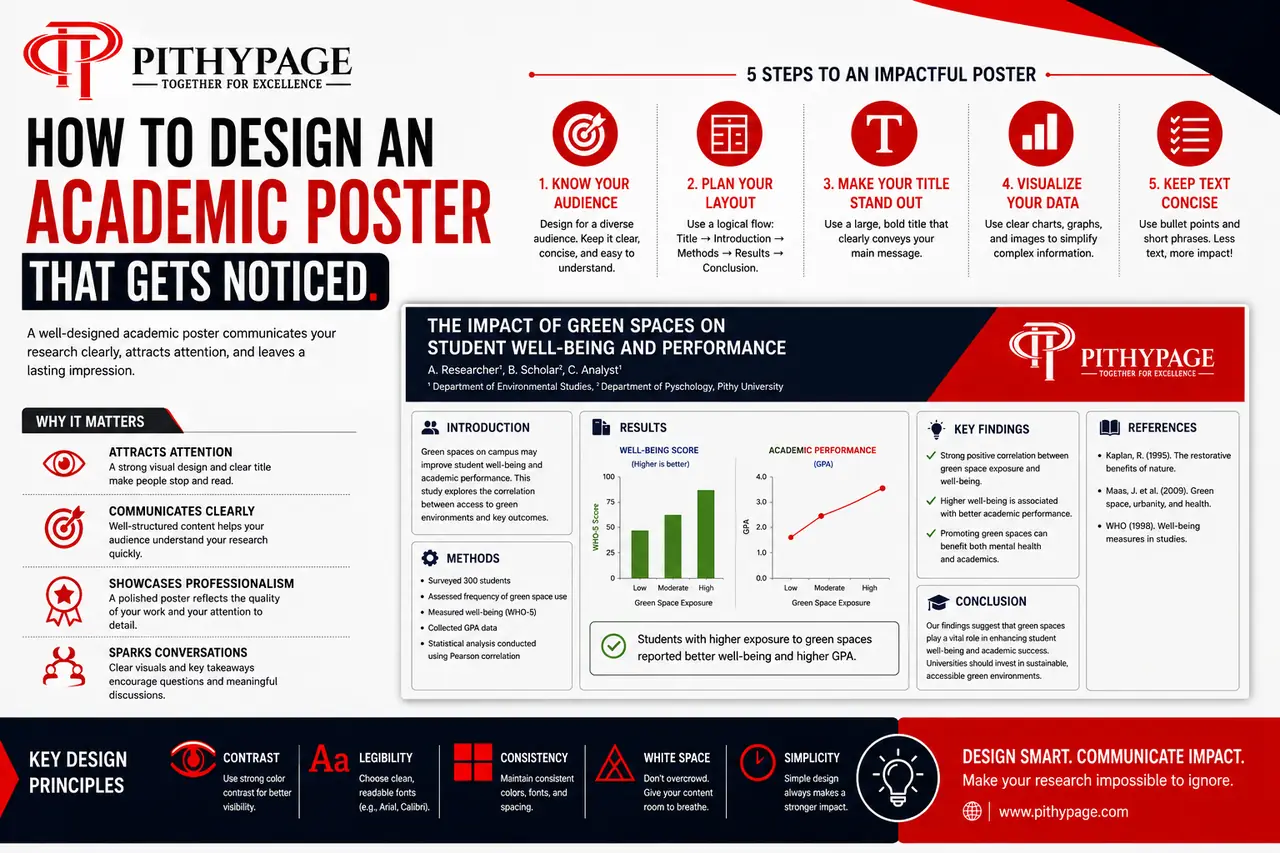
An academic poster has about three seconds to earn a second look. At a conference or a poster session, people walk past dozens of posters, and most get judged on layout and clarity long before anyone reads a single sentence. Good academic poster design isn’t about cramming your whole project onto one page – it’s about deciding what to leave out.
Here’s how to design a poster that actually gets read, not just glanced at.
1. Start With the Message, Not the Template
Before opening a design tool, write your poster’s single takeaway message in one sentence – the thing you want someone to remember if they read nothing else. Every section of the poster should support that sentence. If a figure, paragraph, or result doesn’t connect to it, it’s a strong candidate to cut.
2. Follow a Reading Path, Not a Grid
Most academic posters follow a Z-pattern or column layout: introduction top-left, methods and results moving down or across, conclusion bottom-right or bottom-centre. Whatever structure you choose, make it obvious where a viewer should start and where their eye should go next – numbered sections, consistent column widths, and clear section headings do this without needing arrows or instructions.
3. Cut Your Text by Half, Then Cut It Again
Full sentences and paragraphs are the single biggest reason posters go unread. Convert your text into short phrases, bullet points, and labelled figures wherever possible. A useful test: if a section takes longer than 10-15 seconds to read from two metres away, it’s too dense.
- Use bullet points instead of paragraphs for methods and findings
- Let figures and charts carry the results section, with a one-line caption stating the takeaway
- Save full explanations for the conversation you’ll have standing next to the poster
4. Make Your Typography Do the Work
A readable poster typically uses no more than two font families: one for headings, one for body text. Section titles should be readable from about two metres away (roughly 60-90pt), and body text from about one metre (24-32pt). Consistent sizing across sections matters more than any single font choice – it’s what makes a poster look organised rather than assembled from mismatched slides.
5. Use Colour to Guide Attention, Not Decorate
Pick two or three colours total: a background, a text colour, and one accent colour for headings or highlights. Use the accent colour consistently to mark the same kind of information throughout – section headers, or key results – so viewers learn the pattern as they scan. Avoid using colour purely for visual interest; every colour choice should help someone find information faster.
6. Design for the Standing Conversation, Not Just the Wall
The poster’s job is to get someone interested enough to ask a question, not to answer every question on its own. Leave visible gaps for the conversation: a “so what?” the poster raises but doesn’t fully resolve, or a limitations point you’re prepared to discuss. This also takes pressure off the poster itself – it doesn’t need to carry your entire project alone.
Frequently Asked Questions
What size should an academic poster be? A0 (841 x 1189mm) is the most common size for conferences, but always check your specific event or module’s requirements first – sizes and orientation (portrait vs landscape) vary.
How much text is too much? As a rough guide, aim for 300-800 words total across the whole poster, concentrated in bullet points rather than paragraphs. If you’re regularly writing full sentences to explain a point, that’s a sign to convert it into a visual instead.
Should I include my full reference list? Usually a short, condensed reference list (key sources only) in a small font at the bottom is enough – bring a handout or QR code linking to the full list if your field expects complete citations.
Getting Help With Your Poster
If you’re not sure how to condense your research into a poster that actually reads well, a second pair of eyes can catch layout and clarity issues you won’t see after staring at it for hours. Our academic poster making help service reviews your draft layout, structure, and content balance before you print. Browse our full range of academic tutoring services for support with the research behind the poster too.